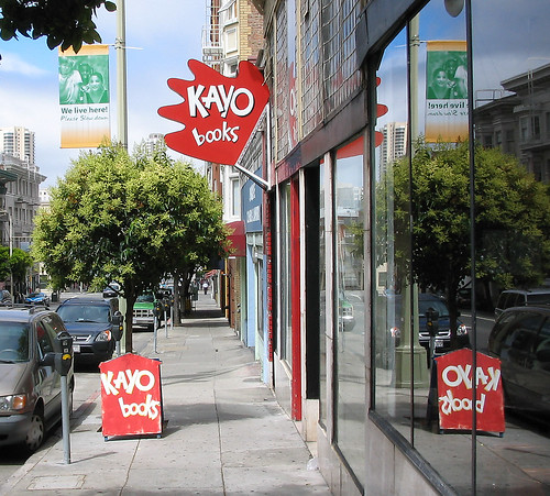
KAYO books in San Francisco has discovered a wonderful way to make a very ordinary storefront feel lively and inviting. A lot of good thinking and a little work makes the store stand out on a street where a lot of signs compete for your attention. The design works because the designer decided to stand out by thinking orthogonally.
Are you designing anything? If so, take a moment to think of a really simple way to make your design stand out from the pack. Is there a way your design can be "orthogonal" to its competitors?
Think orthogonal.
Keep in touch! Sign up to get updates and occasional emails from me.
7 comments:
Orthogonal, even.
The thing about this design is not that it literally sticks out at right angles, but that it breaks the sign-as-square-panel straighjacket.
Designers have a habit of creating new stereotypes as quickly as they break the old ones though, don't they?
Thanks Matt,
One of my favorite things about blogging is you've got an army of editors to catch your mistakes and save you, um, embarrassment :)
What I like about this design is a number of things. I like that it sticks out at right angles, I like the color, shape and tone of the sign. It's jaunty attitude toward the street is in keeping with the store's identity.
I also like the way the street placard echoes the sign coming out from the wall.
my problemo with that sign, is that every single time i see it, i think it's a japanese manga comics store. But it's not at all! that's what's wrong with that design, for me.
The design certainly doesn't say "bookstore" to me at first glance. But it is attention grabbing, and it appears to say something about the contents of the store (hip, irreverent, fun). It really is a design that delivers a message rather than one that's just made to look nice.
Interesting idea.
I like it because it's simple and pretty easy to implement. Of course, it's also perfectible.
Regards,
m.
http://mauricioyury.blogspot.com
.
I agree with arno's commment. Another problem I have with it is that it only works as a design approach when it's the only one in the street. As soon as another store takes the same approach, you end up with a visual shouting match.
I agree with Catherine about the lack of visual competition being a boon for this sign. This sign would stand out on almost any street, but it benefits from being unique.
I was reminded of this article when I was in Chicago recently and walked down a street where a number of small, trendy shops had taken advantage of the perpendicular signage option. None were as bright as that one, but they were certainly more distinctive than the old world pub signs you see in London or Edinburgh. My eye was drawn to them, but not overwhelmed by them.
I think if they'd all been as bright as this one, I might have been annoyed.
Post a Comment